welcome to cardo+ | Portfolio Categories Branding
150
archive,tax-portfolio_category,term-branding,term-150,ajax_fade,page_not_loaded,,select-theme-ver-2.1,wpb-js-composer js-comp-ver-4.5.1,vc_responsive
evolve-1

Evolve

This is a CRM product developed by misoft systems (former accesa). We created the logo for them, that was dynamic and suggested the idea of evolving, along with using the misoft colors. We also created for them a family of little characters to better depict the concepts and make the product friendly


Year: 2010

COVRIGUL-3

covrigul.ro

logo and graphics creation for a pretzel company


Year: 2014

bluetelligence-2

Bluetelligence

We were asked to help update the logo of Bluetelligence. We were happy to do it, we took the original dot logo, we folded it and got the letter “b”


Year:  2011

credit-geeks-logo

CreditGeeks

Credit geeks asked us to create a logo for them. We were happy to take the challenge since we were sure it will lead to a fun and nice output


Year: 2010

screen-preview-2

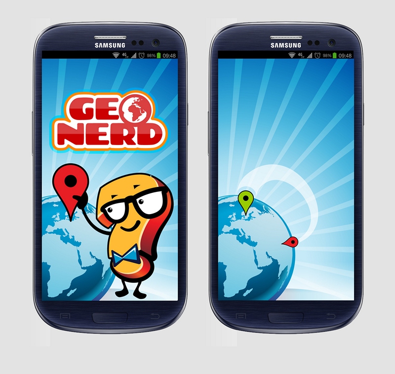
Geo Nerd

We used the same character from the Football Quiz app, the question mark, but this time we were required to make him brainy and geeky for a more nerdy quiz app.


Year: 2013

screen-preview5

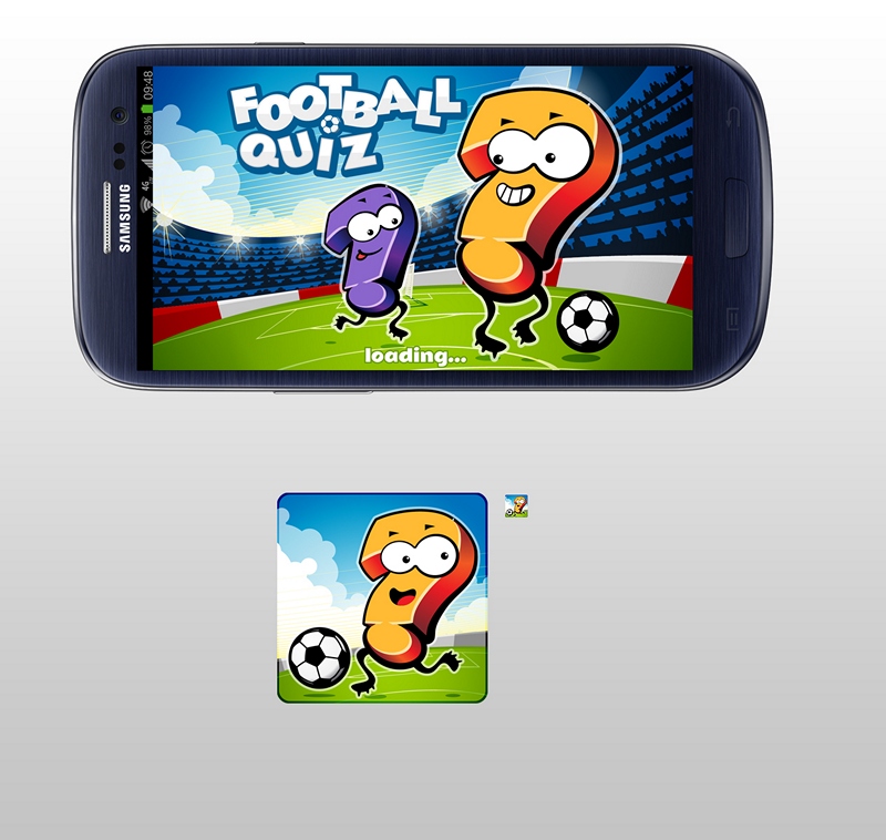
football quiz app

A very cute project where we had to create the interface design and concept for a mobile quiz game. We thought of making a character out of a question mark that we could use throughout the game.


Year: 2013

ribbon

accesa 10 year anniversary

We were very happy to celebrate 10 years of accesa. We created a specific pattern for this occasion and also, we custom created some hand-made elements depicting the number “10” that we used for the printed materials


Year:2014

techleague-logo-3

TechLeague

TechLeague is powered by accesa and it was created for learning, mentoring, knowledge-sharing, promoting excellence in the IT field, innovation and initiative. Also, it creates learning opportunities for people with a passion for technology. Accesa built six pillars that each contribute to speed access to all opportunities.


We created an image for the brand thinking about these people with a passion for technology, so we combined people and code in a simple symbol.


Year: 2012

logofolio

Logofolio

A selection of our logos starting from way back. Some of them are updated but we wanted to have a timeline


Year: 2006-2015

logo-accesa-4

Accesa re-branding

A big re-branding project: one of our oldest clients, misoft systems, evolved consistently to the point where a re-branding was in order, to match the new direction where the company was headed and to reflect their expertise. So, in 2012, misoft systems became accesa. We were proud to be part of the process. Here are part of the results of this journey.


Year: 2012